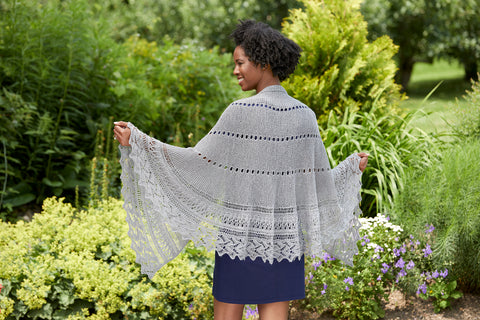

With over 7 million colors visible to the human eye, sometimes settling on even three of them for a knitting project can seem overwhelming. Many times knitters will only choose the colors that the sample project was designed in since even taking a small step into color choosing can seem calamitous. But never fear! With a little journey through color theory and a few simple guidelines, choosing the colors for your next three-shade project will be easy and fun!
The Color Wheel & How Your Yarn Fits In

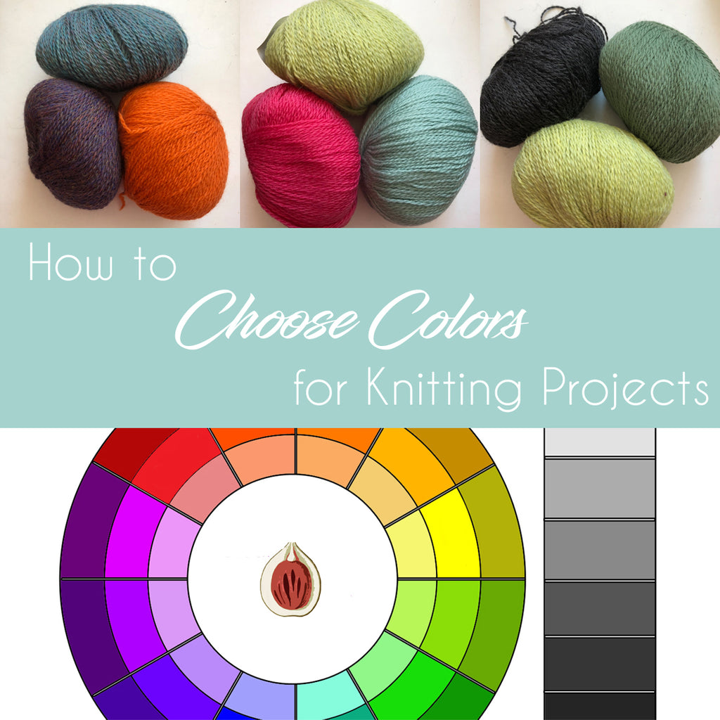
Above is a color wheel; this is an organizational tool for the color spectrum developed by Isaac Newton in 1666. A standard color wheel has red, purple, blue, green, yellow and orange, in that order. Red, blue and yellow are the primary colors (from which all others are made) and purple, green and orange are the secondary colors that are created by mixing red and blue, blue and yellow, yellow and red, respectively. The color wheel also includes tertiary colors which are red purple/blue purple, blue green/yellow green, yellow orange/red orange. These exist between the primary colors and the secondary colors.

Brights
The brights of this color wheel are in the middle ring. To say a color is "bright" in this case means that it is unadulterated with black or white; it is as close to pure pigment as possible. When categorizing yarns into this section think of a child's basic crayon box -- if the color you are looking at would fit in with those crayons, then it can reasonably be put into the middle ring of the color wheel as a bright.
Tints
The inner ring of the color wheel is comprised of tints; these are brights mixed with white and are typically are described as "pastels." If your yarn is a color that is less intense than a bright and seems to be lighter than the middle ring you probably have a tint.
Shades
The outer ring of the color wheel is comprised of shades, these are the brights mixed with black and are notably more muted than the brights in the middle ring. If your yarn is more complex than the bright hues in the middle, if it seems darker and possibly richer, you probably have a shade.
Neutrals
Beside the color wheel is a neutral spectrum, this runs from white to black and encompasses the many shades of gray in between. Brown and beige can also function as neutrals and are much warmer than true grays.
Choosing Great Combinations
When you begin to choose your color combinations remember these two terms: Analogous color combinations: Beginning with one color on the wheel and moving through three or more colors in either direction.
Complementary color combinations: Beginning with one color on the wheel and moving directly across the color wheel to choose its complement. For example, red complements green, yellow complements violet and blue complements orange.
The trick to remember this is that when using a complementary pair the primary color does not make the secondary color; for example, blue does not make orange.

Brights & Neutrals
One way to pick a harmonious set of three colors for a project is to use two brights and one neutral. That means selecting two colors from the center ring of the color wheel that you enjoy, and one neutral shade to marry them together. The blue and orange above are complementary brights from the center of the wheel and the gray is a neutral from the neutral spectrum.

Or choose two neutrals and one bright, this really emphasizes the bright color that you have chosen as this red, black and white combination illustrates.

Brights & Shades
Try pairing a single bright color from the center ring with two shades from the outer ring. The bright yellow in the above photo is set with two darker shades of teal/blue and purple. The yellow and purple are complementary, and the blue and purple are analogous.

This combination begins with the bright orange and then uses the blue shade as a complementary color, again paired with an analogous purple shade from beside the blue

Brights & Tints
Pair a bright color from the center ring with two tints from the inner ring. In this example, the bright pink is paired with a blue tint and a green tint, traveling across the color wheel for a complementary mix and adding an analogous third.

Tints & Shades
Try beginning with a two tints and pairing them with a shade. This combination of light blue, muted blue and light yellow are two primary shades that look more sophisticated when paired as tints and shades.

Alternately, work with two shades and add a tint. The dark rust red and the forest green shades of this mix are complementary and work well with the light tan tint, which also functions as a neutral.

Tints, Shades & Neutrals (Oh my!)
Now select a tint from the inner ring and a shade of the same color from the outer ring and pair them with a neutral. In the above example there is a light green tint, dark green shade and a neutral black. This is a great way to use multiple version of your favorite color!

Another option is to use a tint of one primary color and a shade of another primary color combined with a neutral, as in the yellow tint, blue shade and white combination shown above.
Color combinations are not something to be intimidated by!
Hone your creative skills by spending time experimenting with the color wheel. Move across three or more shades in a row for analogous combinations or jump across the center for complementary combinations, and then change them up with tints and shades.